Chopsticks

Logo

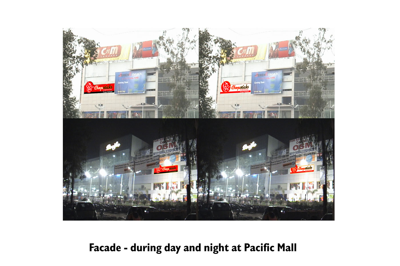
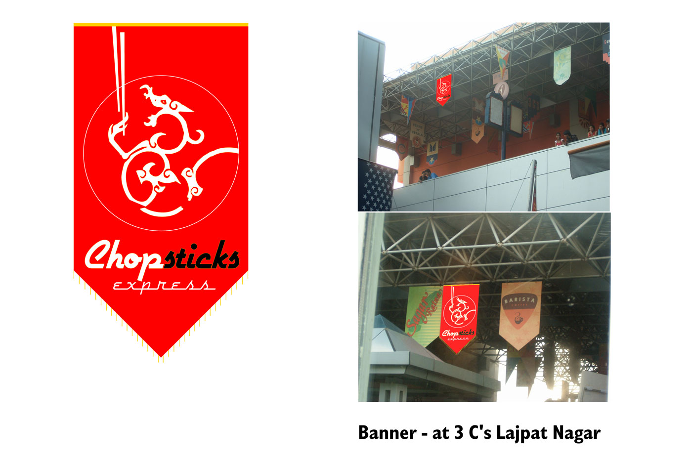
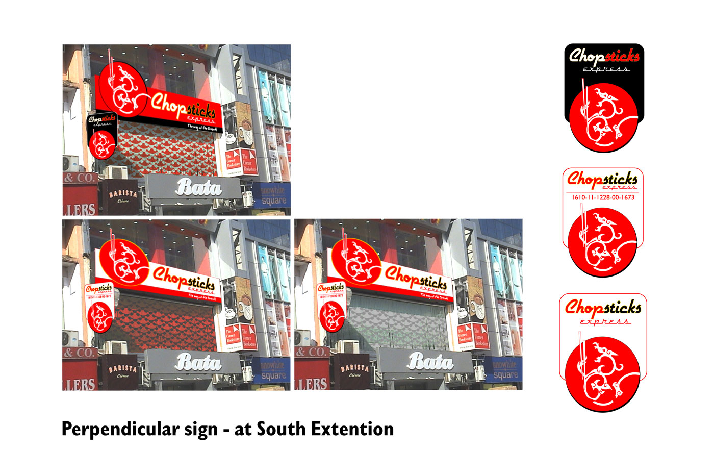
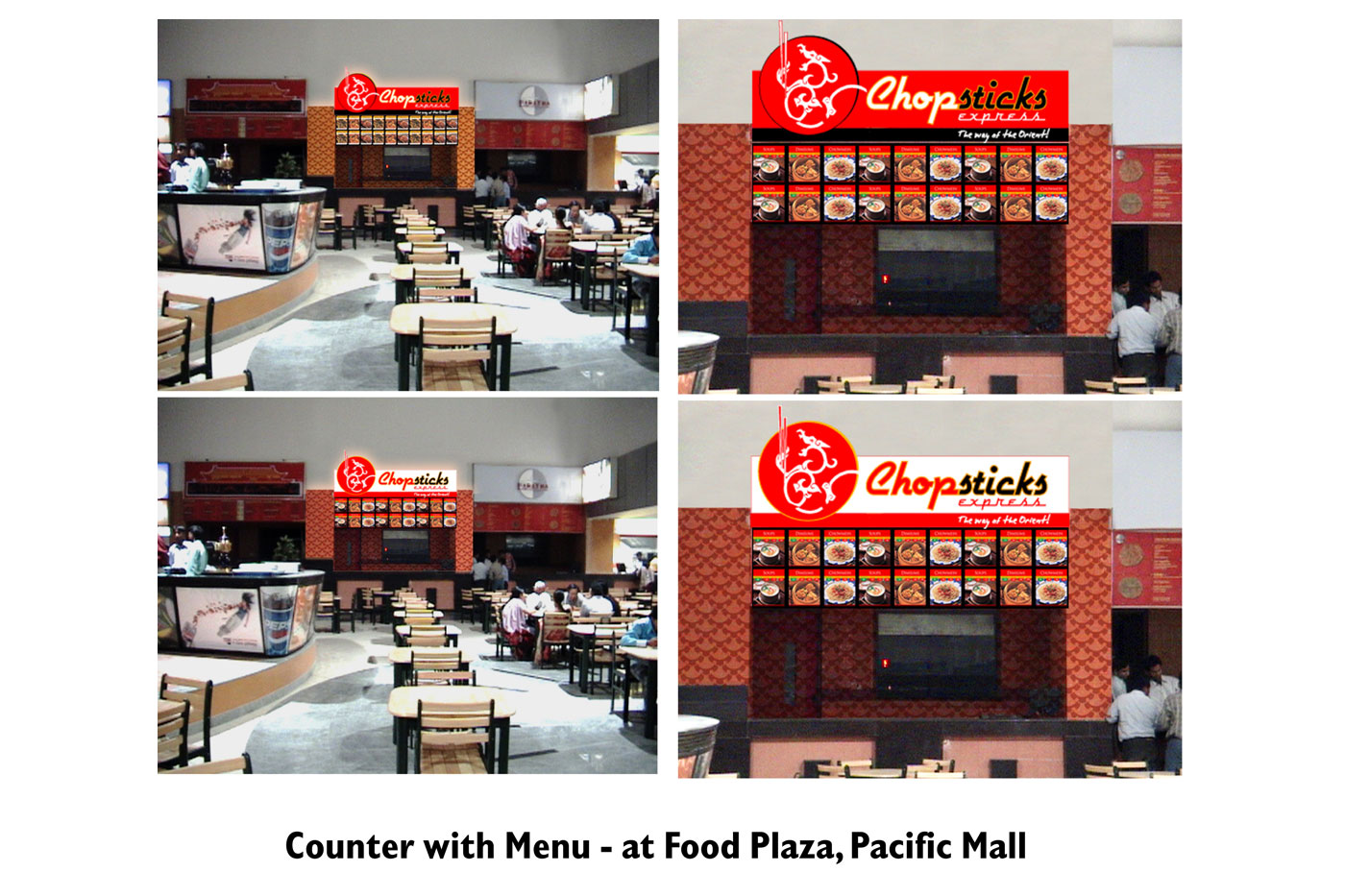
A successful Chinese cuisine restaurant in the Asiad Village Complex, New Delhi, wanted to spread its reach across the highly lucrative fast food segment in malls across the city.

It had to be repositioned such that it retained its distinctly classy character, while adapting to a new persona in keeping with mall-culture.


E-Factor

Logo

Satya Paul design studio in association with Timsy Anand of Andaaz, hosted a series of fund-raisers in an attempt to contribute to the world wide mobilization of aid towards the victims of the Indian Ocean earthquake and tsunami of 2004. The collection was called ‘Aqua’, inspired by the various moods of water.

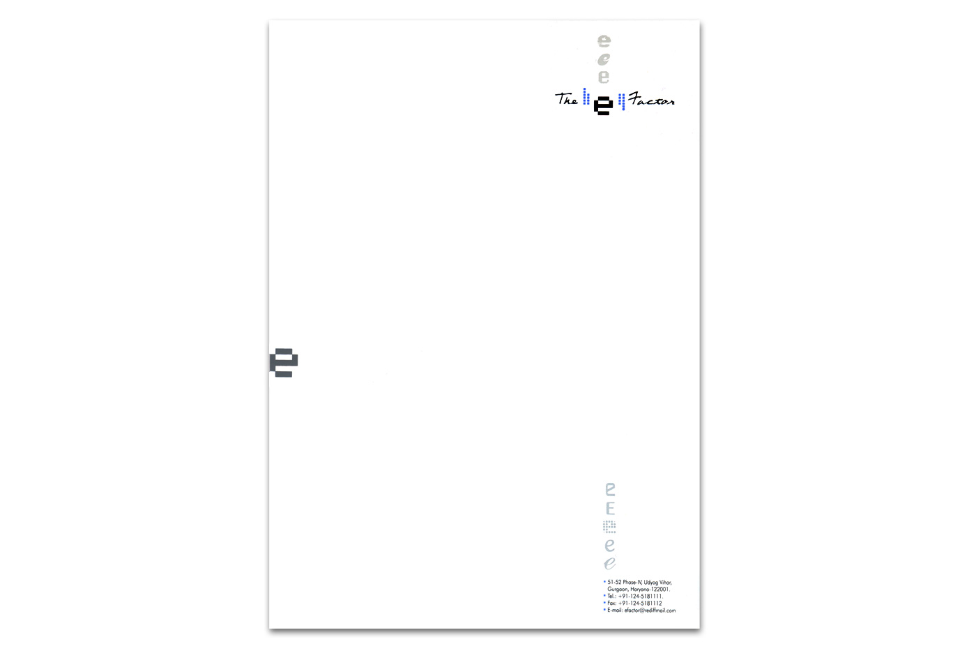
This project includes identity design and marketing collateral for ‘E-Factor’, the company that managed the above events. The design deliverables also include admission tickets for the Aqua event.

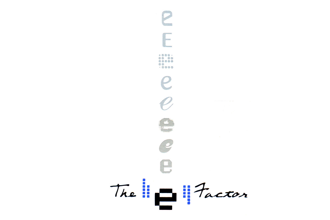
The E-Factor identity represents a youthful, versatile, lively and sophisticated organization (many e’s!).


The Hibiscus

Logo

Taking forward the idea of environment friendly architecture, The Hibiscus, named after one of India’s most vibrant flowers, precious both as an offering at prayer and for its medicinal properties, is an exclusive residential space, conceived to provide a peaceful, sheltered community for the like-minded to create families from a circle of friends.

The symbol takes inspiration from the hibiscus flower. The flower’s style, filaments and anthers form a lighthouse, representing the leading and guiding light of a unique lifestyle concept. The aesthetic is geometric – inspired by the work of Paul Friedberg, who is also the landscape architect of this residential space.

Part of the SS Group, the residences were designed by architect Ramesh Khosla.


ISMW

Logo

The Indian School of Microfinance for Women (ISMW), provides financial literacy to poor women. Through knowledge giving and collaboration with other relevant organizations, it strives to act as a catalyst in the quest for empowerment. The school is supported by the Citi Foundation and promoted by the SEWA bank.

In the symbol, the dot containing form is the ‘Diya’. Diya is the light that educates, and also the vessel that contains and secures. The form encapsulating the Diya depicts the coming together and spread of an initiative to uphold the rights of the poor.

The red dot is a ‘Bindi’, the symbol of Shakti (feminine principle and energy, according to the Indian tradition). The Bindi is worn between the eyebrows – the seat of wisdom. Therefore, in the symbol, Bindi also represents education.

The form is dynamic, representing a catalyst. Though inspired from an Indian context, it caters to a wide audience, both indigenous and international.


Shipra Gupta